During the spring of 2024, I had the opportunity to speak at several conferences about Power Pages Fusion Team development and show different ways how a pro-code developer can create solutions in ways that enable low-code developers to participate more in Power Pages projects. Web Template components are one of these methods and in this article I will go through in more detail how they can be implemented through one example.
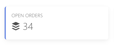
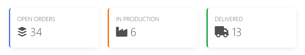
In the picture you can see a simple card component that visualizes the number of open orders. A component like this can be implemented as a Web Template using the Liquid query and setting values in the custom HTML user interface. However, this requires pro-code skills, because even in such a simple implementation, you have to jump to the code side.
Configurable Web Template component
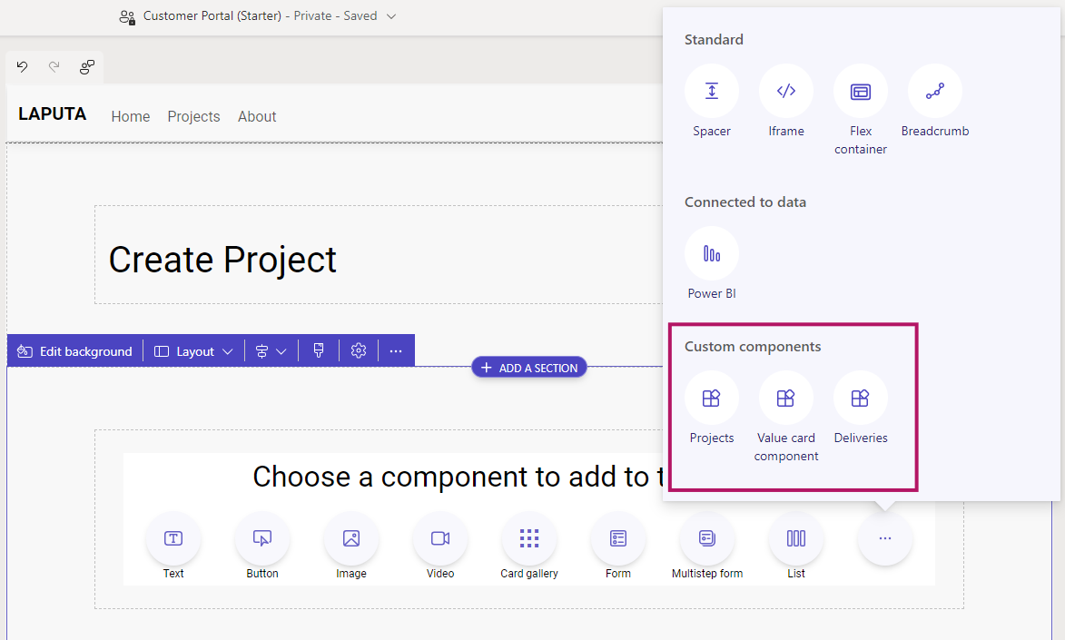
Web Template components currently support manifest description. With the help of the manifest, parameters can be described for the component, which can be used to configure its operation. Nowadays, Power Pages Design Studio shows the custom components to be added to the pages if they have a manifest described. This makes it possible for low-code developers to add and configure these components very simply as part of pages.
Creating Value Card Component (pro-code)
Let's go through how to implement the fully configurable Value Card component, which is used in the example site's project page. The component retrieves the value of a certain field from the Dataverse table and presents it in the user interface. In addition to this, the user interface can be parameterized for the title, border color and icon.
The operating logic of the component has been made fully parameterizable and all necessary parameters are described in its manifest.
{% manifest %}
{
    "type": "Functional",
    "displayName": "Value card component",
    "description": "Highlight value in custom card component",
    "params": [
    {
        "id": "tableName",
        "displayName": "Table",
        "description": "Dataverse table schema name"
    },
    {
        "id": "columnName",
        "displayName": "Column",
        "description": "Dataverse column schema name"
    },
    {
        "id": "fontAwesome",
        "displayName": "Icon",
        "description": "FontAwesome class"
    },
    {
        "id": "borderColor",
        "displayName": "Color Indicator",
        "description": "Hex color to left border"
    },
    {
        "id": "cardTitle",
        "displayName": "Title",
        "description": "Text shown in card"
    }
    ]
}
{% endmanifest %}
Parameterized data is included in the Card Component HTML code using Liquid according to the example below.
<div class="card" style="border-left: .25rem solid {{ borderColor }}!important;">
<div class="card-body">
<h5 class="card-title">{{ cardTitle | default: 'TITLE' }}</h5>
<h1>
<i class="{{ fontAwesome | default: 'fa-solid fa-industry' }}"></i>
<span id="{{ columnName }}"></span>
</h1>
</div>
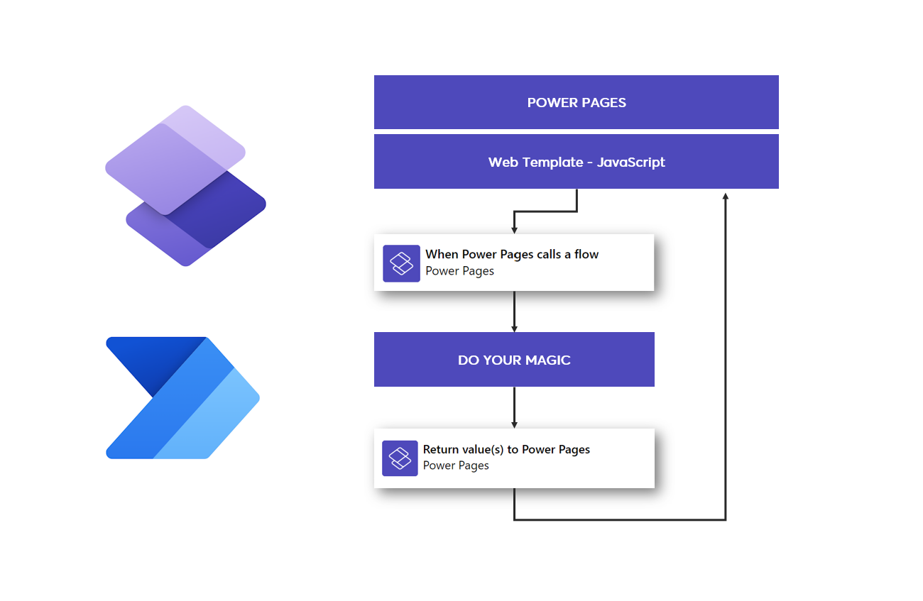
</div> In order for the component to work dynamically, also in terms of data retrieval, in this example a JavaScript call is made to the Dataverse API interface with defined parameters. This makes the component reusable in different scenarios.
(function(webapi, $){
  function safeAjax(ajaxOptions) {
    // Sample safeAjax code from Microsoft Learn site
  }
})(window.webapi = window.webapi || {}, jQuery)

$(document).ready(function () {
  function getValue(id, table, column) {
    webapi.safeAjax({
      type: "GET",
      url: "/_api/" + table + "(" + id + ")?$select=" + column,
      contentType: "application/json",
      success: function (res) {
        $('#{{ columnName }}').text(res[column]);
      }
    });
  }

  getValue('{{ request.params.id }}', '{{ tableName }}', '{{ columnName }}');
});
Using Value Card Component (low-code)
Once the component has been created and a manifest has been described for it, the low-code developer can add the component to the page directly from Design Studio.
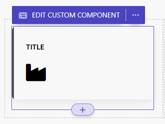
When the user selects "Edit Custom Component", the editor displays the fields defined in the component's manifest where the desired values can be set.
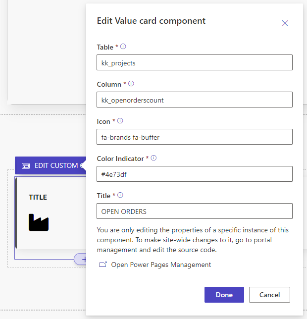
By parameterizing your component in this way, you can make it reusable and easier to modify. The parameters can affect the displayed information or the visual appearance.
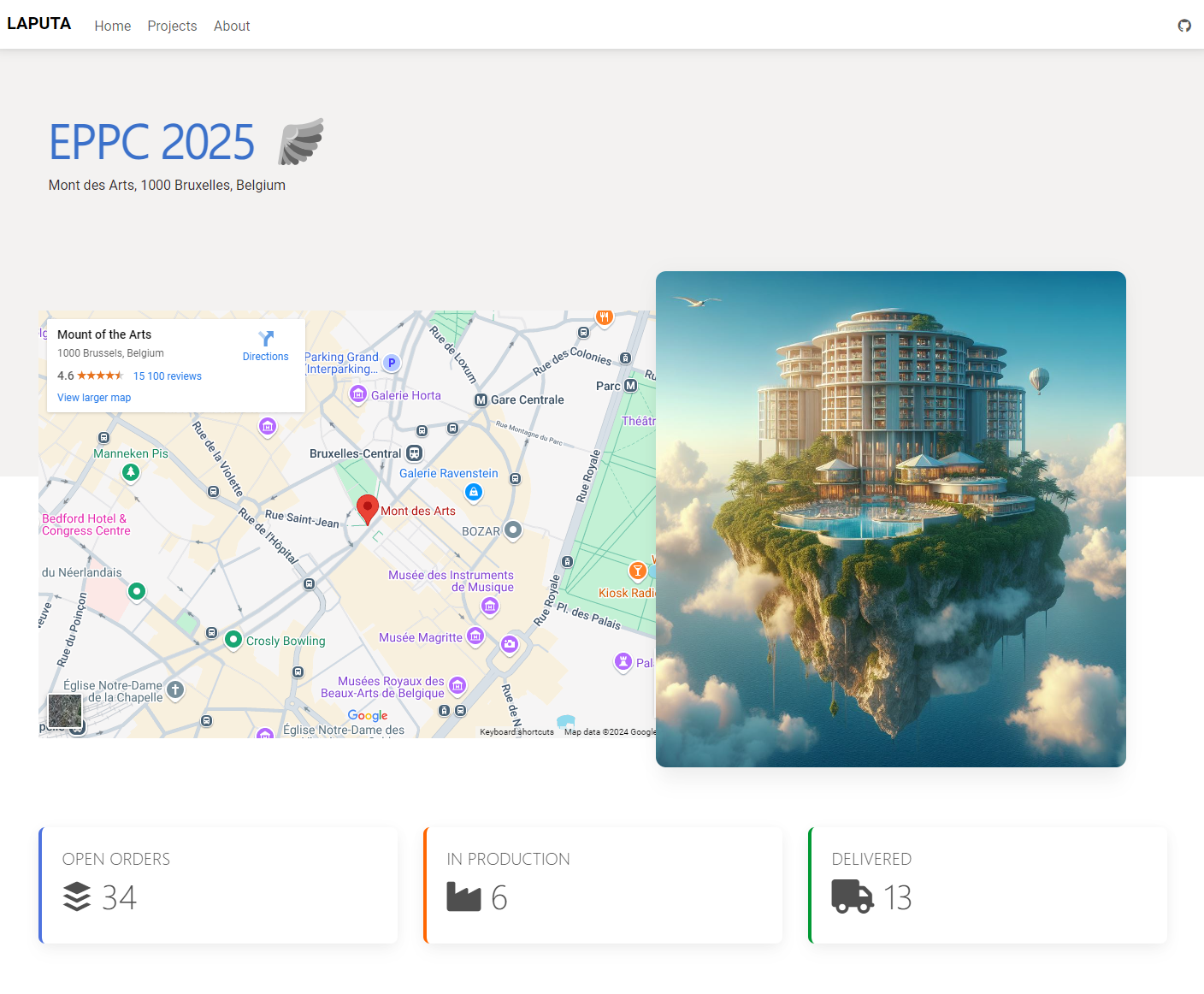
For example, the same page can display different values with different visualizations using the same component as in this example below.
Summary
Web Template components are a great example of how Fusion Team development brings new opportunities for building Power Pages sites. In my opinion, every pro-code developer should change his thinking model so that when making implementations, he considers whether it would be an advantage to enable the definition of a component by a low-code developer.
Some key points of creating web template components
- Break custom logic to own components
- Smaller components are easier to develop and maintain
- You can mix custom and native components in same page
- Make components re-usable if it makes sense
- Give makers possibility to configure component with manifest
- Make sure that editor is still functional for makers
Of course, it doesn't make sense in all situations, but often a component is created on pages that is reused as is or with small visual modifications, but these changes are made on the code side. Now, by parameterizing the components, this functionality can be brought to the Design Studio side.